Lessons in Website Usability from a Toilet
Spending my career building websites, focusing on design and usability, it’s sometimes hard to turn off outside of work. I try my best, but sometimes such an egregious display of poor usability slaps me in the face, it’s impossible to ignore.
I recently stayed at an Airbnb. The place was beautiful, clean, and the perfect location for my family holiday. But then I walked into the bathroom. I’ll spare you the details, but when I went to flush the toilet there was no lever. Instead there was a knob in the centre of the water tank. I was confused.
- How do I flush?
- Is this a cupboard door on the water tank?
- Is the lever inside?
As panic started to set in I noticed a note sitting on top of the toilet.
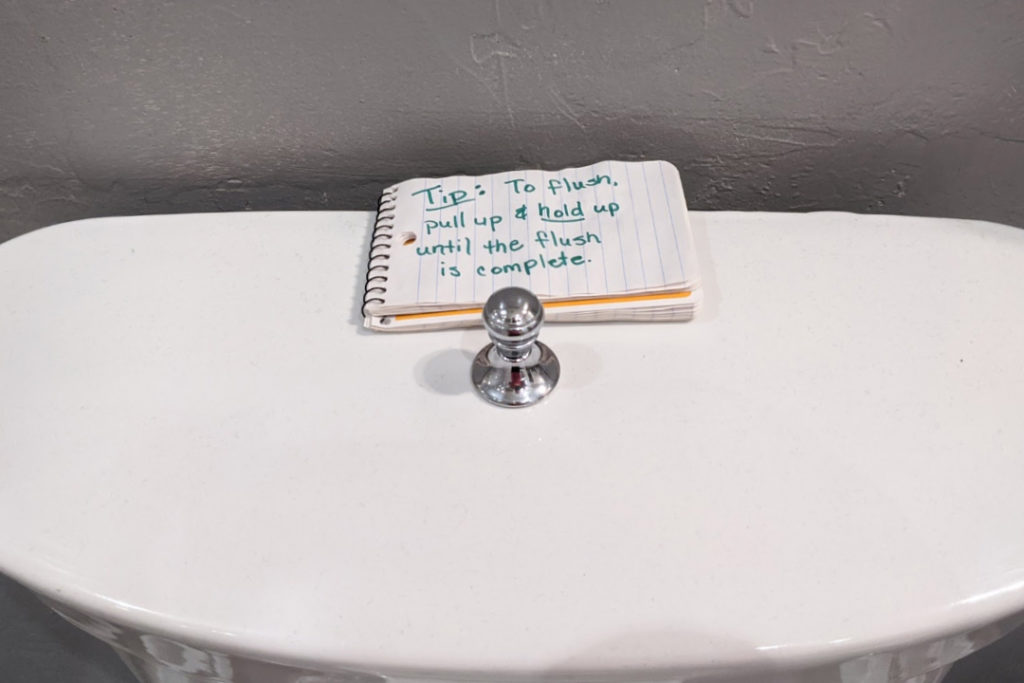
It read: “Tip: to flush, pull up & hold up until the flush is complete”
I was so relieved. Again.
Aside from being traumatic, the whole experience reminded me of some of the basic principles of usability.
1. If you have to explain it, you didn’t design it well enough
The note from the Airbnb owner was nice, and it helped guide me to a successful flush, but well-designed products should be intuitive. Sure, my example is trivial, and the note took a few seconds to read, but when extrapolating this to a product or website, having to read a manual or follow instructions can be the difference between converting a user or losing them.
Brands that need to explain how to pronounce their name, or websites that need a tutorial to show you how to navigate are poorly designed. Even the dreaded “click here” is the website explaining what you should do.
Good website design makes it obvious what the user should do through visual clues like colour, size, button design and animations on hover. Then you can use text to provide useful information like the name of the page they will be taken to, or the action that will occur (ie. “Book a Call”).
2. Best practices exist for a reason
Is the lever-based flushing mechanism the easiest way to flush a toilet? Maybe. I haven’t done much user-testing in that field. But the one thing I do know is that in North America, the lever is the typical mechanism for flushing toilets.
When a product is consistently used the same way by most users, we call that a convention. When that convention also becomes recognized as the optimal way to use that product, it becomes a best practice.
Again, I’m no toilet expert, so I can’t say for sure if the lever approach is a best practice, but I’m certain it’s a convention. When this toilet designer chose to use a knob instead of a lever, they were going against centuries of learned behaviour. By ignoring conventions – and more importantly best practices – you’re asking the user to retrain themselves.
3. Necessity is the mother of invention
Have you had a hard time flushing a toilet? I’m guessing not. So to reinvent the flushing mechanism is totally unnecessary.
There are times when conventions and best practices become dated. As humans, technology, and society evolves, the way things used to work may not be the way they’re being used any longer. This is when we should start looking to innovate or invent. When it becomes necessary.
One of my biggest pet peeves is designing just to be different. There has been no evolution in humanity or technology that has made flushing a toilet more onerous on a user, so there is no need to change it.
4. Don’t let design trump function
Sure, the knob looked nice. Arguably nicer than the standard lever. But to make a great toilet/website/product, “looking good” should not come at the expense of being easy to use.
We fall into this quite often in the graphic and website design industry. There are so many websites in existence, there is an innate desire to make something unique – especially from a marketing perspective. So while we want to make every client stand out, making usable websites is the top priority.
This isn’t a complete list of usability principles, just some of the basic ones you can keep in mind. These principles can be applied to everything in your life, and often are without you even realizing it. Sure that couch looks incredible, but if it doesn’t fit in your living room, what’s the point?
 About Island