A look at the rebrand and website design for Burgess Law
Focusing on clients that are interested in a personable approach to legal practice, Burgess Law was built around putting client service first while being a viable alternative to big law. As a boutique firm, Burgess Law is always looking for ways to improve his process for clients.

After a discouraging three attempts at a rebrand and website redesign process, Burgess Law approached us about what to do next. Our first step was getting them to trust the process again. We did this by helping them understand the value in realigning the brand visuals with the superb client experience they were already providing. We discussed the importance of creating a more cohesive brand, and showed them that a new brand wasn’t just slapping together a new logo, but providing a well thought out experience for new, existing, and potential clients.
Our primary goal for the new brand was to consistently communicate the personality and work style of Burgess Law. As a boutique firm they pride themselves on service and relatability, so we believed the visual identity should match that level of professionalism. The nuance was in finding a way to communicate that professionalism accurately. We didn’t want to create an identity that confused users or gave the false impression of a large firm. Although that might look good at first glance, it wouldn’t achieve proper alignment of expectations for potential clients.

Burgess Law offers a modern approach to a historically traditional industry, so when we first hit the drawing board we hoped to mix traditional and modern design elements to show the bridging of two ideas. If the design leaned to formal it would look institutional, if it looked too boutique we risked looking less professional. We decided the best approach would be to take classic elements that exuded confidence in their work, but remix them with modern touches that showed a firm that was willing to grow with the times.
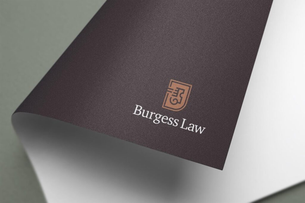
What we arrived at was a logo mark that took a traditional legal element – the badge and letter – and made it more unique. We did this by using a non-traditional shape, breaking the border to represent a new approach to the cycle, and adding lines to show movement. We paired this badge with a font that mixes elements of a classic serif font with hints of the harder lines seen in more recent typography.
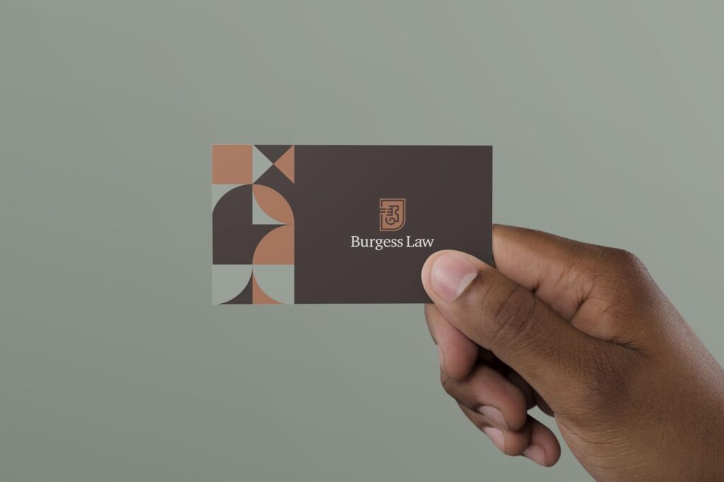
Once the logo was just right, it was time to focus on the rest of the details. We wanted to avoid the striking blues and hard lines that are commonplace in traditional law brands. We wanted to open the visuals up to a more inviting and representative palette of the Burgess Law experience. We landed on a mix of browns and toffee that give off the warmth and inviting experience of Burgess Law, while staying sophisticated in nature (think leather bound books, antique desks, and the smell of rich mahogny). Along with the palette we included a mid-century-esque pattern with a rounded form as an added design element that’s used throughout the brand.
The website itself was designed to utilize the new brand in a way that creates an inviting platform and experience no matter how you access it. We believed that the site should give you an instant understanding of the quality and personality of Burgess Law. The feel should instantly tell you about who they are and help the user determine if they’re the right fit.

Island always creates and designs custom sites in-house. This detailed approach for development and designs ensure that we aren’t limited to any template limitations or generic designs. It also allows us to build the exact features and tone necessary to match the uniqueness of each client. Much like the brand we continued the theme of mixing traditional and modern elements to arrive at a unique bridge between the two. This means integrating things like drawer menus and full width containers with straightforward service descriptions and traditional body & header typography.

With the new design and website completed, the branding was limitless. We created custom spot gloss designer business cards, as well as personalized letterhead templates, powerpoint presentations and a reskinning of social media platforms. The end result was a cohesive and organized brand that reflected the personality, professionalism and creativity of Burgess Law.

 About Island